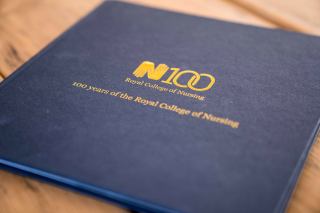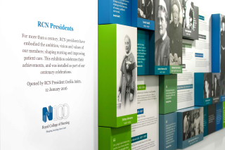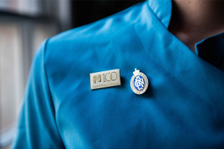
Healthcare has been close to our hearts since the early days of Fluid, so being able to re-brand an organisation like the Royal College of Nursing in its hundredth year was an absolute honour.
- Phil, Founder and Joint Managing Director
Introduction
Since 1916, the Royal College of Nursing (RCN) has represented and supported millions of nurses, embodying the ambition, vision and values of its members whilst dedicating itself to shaping the profession. With almost half a million members at any given time, the RCN is the world’s largest professional association for nursing staff. And being selected to create their centenary brand is one of Fluid’s proudest achievements.
Disciplines
Brand identityTone of voiceCreative campaignsGraphic designThe idea
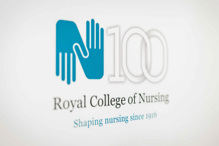
Embracing the spirit of sensitive evolution, we made gentle modifications to the RCN’s iconic logo, before adding an interlinking 100 motif to commemorate a century of impact at the heart of healthcare. The centenary emblem itself was designed to imply longevity and unity, providing an abstract reference to the infinity symbol, whilst also forming the focal point of our campaign messaging.


The campaign
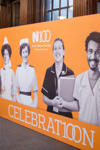
The RCN100 brand campaign was underpinned by bold and emotive messaging that would celebrate the passion, dedication and ambition of the nursing profession, whilst commemorating the role of the Royal College as a uniting voice. From campaigns through to exhibitions and events, our branding adorned all manner of projects, initiatives and merchandise, and was even hand-stitched into a traditional Marching Banner by the talented embroiders at the Townswomen’s Guild.

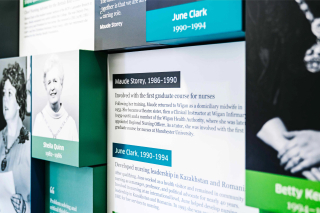
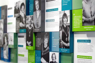
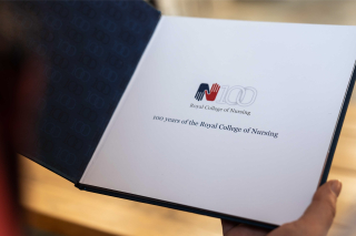
The centenary branding perfectly captures the juxtaposition of the College’s heritage and the dynamism of the modern nursing profession.
Our hands logo was originated in 1984, and this latest iteration by Fluid Ideas is a sensitive update which retains brand recognition while also welcoming a new era for the College.
- Sarah Abley, RCN100 Communications Manager


