Working with Fluid is entering into a partnership in the truest sense of the word, they truly feel like an extension of my team.
- Debbie Jones, Head of Marketing, Lifeways
Celebrating 25 years of life-changing support
Founded in 1995, Lifeways has a resolute passion for supporting people. To live life with happiness, independence, and ambition. This was clear for us to see when we were approached to refresh their brand identity on the eve of their 25th anniversary. For Lifeways to be recognised, remembered and trusted by individuals, families and healthcare professionals, our responsibility was to keep the branding compelling, consistent and clear. And in a sector where few stand out as being different, we had an exciting opportunity to create a meaningful point of difference.
Disciplines
UX & digital designWebsite developmentHostingBrand identityTone of voiceCreative campaignsGraphic designArtworkingPrint managementVideo & photographyAnimationSocial media managementSocial media advertisingSearch engine optimisation

Refreshing an authentically different brand
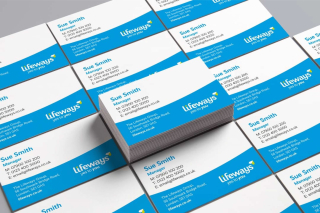
Small changes can make a big difference. We sensitively refreshed the logo by softening and creating a more friendly and approachable feel. For the colour palette, we created a theme that’s energetic and positive (along with importantly meeting AA accessibility standards in all formats). Choosing Realist as the new font was easy - it's friendly style complements the Lifeways logo and is clear to read at different weights.
The curve from the ‘y’ of the new logo is a graphical element in the designs - we think it creates a smile shape, as well as making a space to frame imagery and hold important messages. The dot from the ‘i’ is also used to create splashes of colourful energy.

Saying ‘yes’ to a new promise
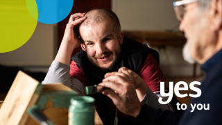
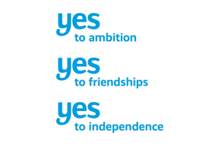
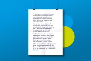
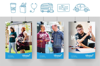
Lifeways holds a longstanding commitment to the people they support - to listen, to respect and to deliver life-changing support. We translated this promise into ‘yes to you’, an optimistic and uplifting new strapline that provides a memorable message for a brand that celebrates ambition, positivity and independence. Its simplicity means it’s easily adapted to communicate with different audiences in endless different ways.
Capturing everyday extraordinary moments
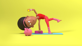
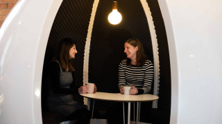
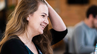
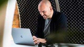
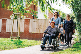
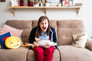
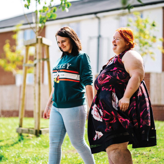
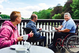
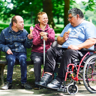
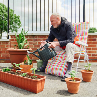
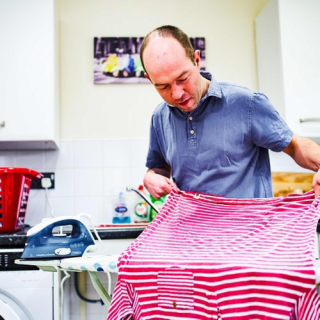
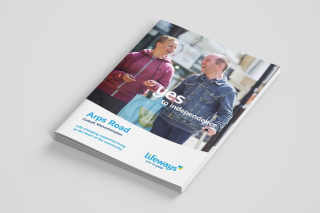
A brand’s photography style is easily one of its most recognisable and unique features. So we wanted to create a bank of imagery that felt just like Lifeways - lively and positive, with people at the heart of everything. Our shoot captured just that - natural, unposed genuine moments of happiness, independence and support that lift and add warmth to the brand.
Strengthening performance with a digital-first focus
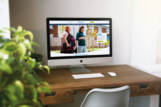
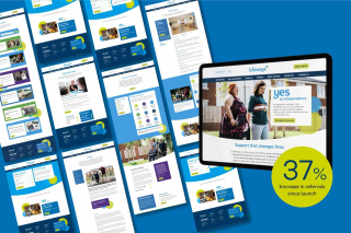
The website is a first port of call for individuals, family members and referrers seeking support options. The previous site was feeling cumbersome and fragmented, so after a set of scoping sessions we quickly defined the plan to create a sleek, fast site with persona-focussed tailored journeys to accomplish the defined goals. A valuable addition to the new site is their online support location search tool which allows users to easily find and browse relevant services by using the location and health condition filters.
Passing the torch for ongoing success
Having an easily editable website was a priority; with nearly 5,000 support locations to manage, a busy careers section and resources, news and events pages, we needed to give Lifeways the ability to control this information quickly and easily. Built in Drupal, the site’s CMS is incredibly intuitive for even the most tech-shy of users. Following our training sessions, Lifeways are delighted with the system and we receive regular (elated) feedback that the site is a dream to update.

I have been impressed with Fluid's knowledge and the lengths they go to on research, design, build, and afterwards once the website is live.
The Drupal CMS is a dream to use - the system is very intuitive and saves time and expense, enabling my team to make additions and amends quickly and easily.
- Debbie Jones, Head of Marketing, Lifeways
